2.2. Bond Energy vs. Distance#
Atoms in solid materials like steel and aluminum are held together with chemical bonds. Atoms of solid materials are more stable when they are chemically bonded together, and it takes energy to separate atoms which are joined together by a chemical bond. The bonding energy associated with a chemical bond describes the amount of energy needed to separate two atoms from their equilibrium positions to a substantial distance apart. In this section we’ll build a line plot with Python and Matplotlib that describes the bond energy compared to the separation distance of a Na+ Cl- ion pair.
Describe bond energy in terms of attractive and repulsive terms#
For an Na+ Cl- pair, attractive and repulsive energies Ea and Er depend on the distance \(r\) between the Na+and Cl- ions.
The active energy Ea and the repulsive energy energy Er of an Na+ Cl- pair depends on the inter-atomic distance, \(r\) according to the following equations:
The total bond energy, En is the sum of the attractive energy term Ea and the repulsive energy term Er:
On a single plot, we can graph Ea, Er and En vs. \(r\) using Python and Matplotlib. Our plot will conform to the following parameters:
The range of \(r\) values should be between 0.01 and 1.00 in increments of 0.01
The x-axis limits should be between \(r\) = 0 and \(r\) = 1.00
The y-axis limits should be between E = -10 and E = 10
We will also include a plot title and axis labels with units. Each of the three lines on the plot will also be incorporated in a legend.
After the plot is constructed, we will determine the equalibrium bond distance 2r* and the equalibrium bond energy E0
Import NumPy and Matplotlib#
The first step to build our plot is to import NumPy and Matplotlib. We’ll use NumPy to build an array that contains the distance values \(r\) and the energies Ea, Er and En. We’ll use Matplotlib to build the plot.
The necessary import commands are below. This section assumes you are using a Jupyter notebook to write and run your Python code. To see how open a Jupyter notebook, see this blog post. If you are using a Jupyter notebook, include the line %matplotlib inline. If you build your code in a .py-file, make sure to leave this line out as %matplotlib inline is not valid Python code.
# imports
import numpy as np
import matplotlib.pyplot as plt
# if using a Jupyter notebook
%matplotlib inline
Create a NumPy array of r-values#
Next, we will create a NumPy array of \(r\) values that starts at 0.01, ends at 1.00 and increments by 0.01. We’ll create the array using NumPy’s np.arange() function. The np.arange() function accepts three input arguments shown below.
np.arange(start,stop,step)
Note that Python counting starts at zero and ends at n-1. So if we want the last value in the array to be 1.00, we need to set our stop value as 1.01.
# create an array of inter-atomic distances, r
r = np.arange(0.01,1.01,0.01) #start, stop(exclusive), step
Create arrays for the attractive energy term, the repulsive energy term and the total energy#
Next we’ll create arrays for the attractive energy term Ea, the repulsive energy term Er and the total energy En. We’ll use the equations shown above in the problem description and our array r to build these three arrays.
Note that exponents are denoted in Python with the double asterisk symbol
**, not the carrot symbol^.
# calculate the energy terms
Ea = -1.436/r
Er = (7.32e-6)/(r**8)
En = Ea + Er
Build a line plot#
Now that we have the four arrays, we can build a line plot with Matplotlib. Each line on the plot is created using a pair of arrays. The first line uses the pair r, Ea, the second line on the plot uses the pair r, Er, and the third line on the plot is described by the pair r, En. Matplotlib’s plt.plot() method accepts pairs of arrays (or pairs of lists) as shown below.
plt.plot(x1,y1,x2,y2,x3,y3....)
After the plt.plot() line, the command plt.show() shows the plot. These two lines have to be in the proper order.
plt.plot(r,Ea,r,Er,r,En)
plt.show()
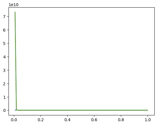
We see a plot, but the plot looks like it only has one line on it. What’s going on? We can only see one line because our y-axis has a very large range, between 0 and 1e10. If we limit the y-axis range, we’ll be able to see all three line on the plot.
Apply x-axis and y-axis limits#
Next, we’ll use Matplotlib’s plt.xlim() and plt.ylim() commands to apply axis limits to our plot. A list or an array needs to be passed to these two commands. The format is below.
plt.xlim([lower_limit, upper_limit])

plt.ylim([lower_limit, upper_limit])
We’ll limit our x-axis to start at 0.00 and end at 1.00. Our y-axis will be limited to between -10 and 10. The plt.plot() line needs to be before we customize the axis limits. The plt.show() line is included after we set the axis limits.
plt.plot(r,Ea,r,Er,r,En)
plt.xlim([0.00, 1.00])
plt.ylim([-10, 10])
plt.show()
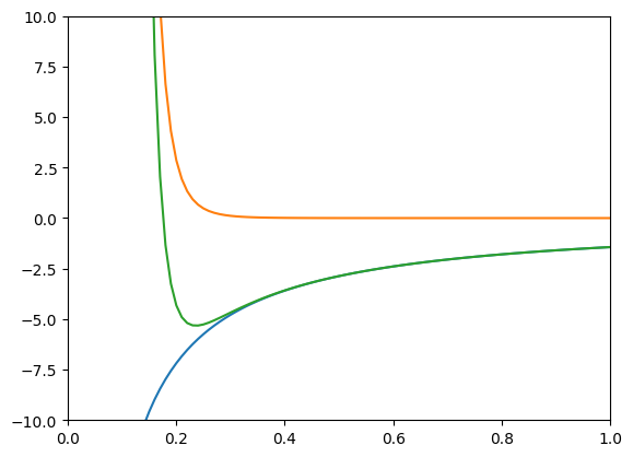
Great! We see a plot with three lines. We can also see the y-axis starts at -10 and ends at 10. Next we’ll add axis labels and a title to our plot.
Axis labels and title#
We can add axis labels to our plot with plt.xlabel() and plt.ylabel(). We need to pass a string enclosed in quotation marks ' ' as input arguments to these two methods. plt.title() adds a title to our plot.
plt.plot(r,Ea,r,Er,r,En)
plt.xlim([0.01, 1.00])
plt.ylim([-10, 10])
plt.title('Attractive, Replusive and Total energy of an Na+ Cl- ion pair')
plt.xlabel('r (nm)')
plt.ylabel('Bond Energy (eV)')
plt.show()
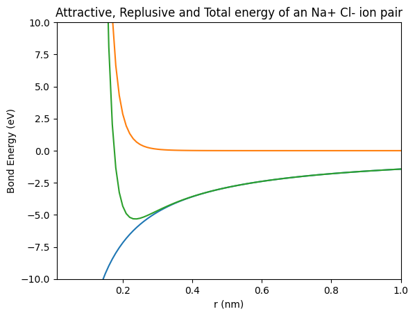
We see a plot with three lines that includes axis labels and a title. The final detail we’ll to add to our plot is a legend.
Add a legend#
We can add a legend to our plot with the plt.legend() command. A list of strings needs to be passed to plt.legend() in the form below. Note the parenthesis, square brackets, and quotation marks.
plt.legend(['Entry 1', 'Entry 2', 'Entry 3'])
The plt.legend() line needs to be between the plt.plot() line and the plt.show() line just like our other plot customizations.
We can also put a grid on our plot if we would like. This can make it easier for others to see the values of the equalibrium bond distance and the equalibrium bond energy. The command to add grid lines is plt.grid().
# plot the three energy terms
plt.plot(r,Ea,r,Er,r,En)

# customize the plot
plt.xlim([0.01, 1.00])
plt.ylim([-10, 10])
plt.xlabel('Inter-atomic Distance (nm)')
plt.ylabel('Bond Energy (eV)')
plt.title('Attractive, Repulsive and Total Energy of an Na+ Cl- Ion Pair')
plt.legend(['Ea - attractive','Er - repulsive','En - total'])
plt.grid()

# show the plot
plt.show()
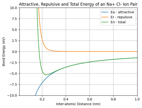
We see a plot with three lines, axis labels, a title, and a legend with three entries. There is one last step. In case we want to include the plot in a report or presentation, it would be nice to save the plot as an image file.
Save the plot as an image file#
If we want to include the plot in a Word document or a PowerPoint presentation, we can just right-click on the plot and select copy image or save image as. We can also save our plot programmatically with the plt.savefig() command. The plt.savefig() command takes a couple arguments including the image file name and the image resolution. Matplotlib infers the filetype based on the filename. The general format is below.
plt.savefig('filename.ext', dpi=resolution)
We’ll save our plot as energy_vs_distance_plot.png with a resolution of 72 dpi (dots per inch). You could use a higher resolution in a printed document, such as200 dpi, but for a webpage 72 dpi is fine. The plt.savefig() line needs to be after the plt.plot() line and all the lines of customization, but before the plt.show() line.
The code below builds the plot and saves the plot as a separate image file.
# plot the three energy terms
plt.plot(r,Ea,r,Er,r,En)

# customize the plot
plt.xlim([0.01, 1.00])
plt.ylim([-10, 10])
plt.xlabel('Inter-atomic Distance (nm)')
plt.ylabel('Bond Energy (eV)')
plt.title('Attractive, Repulsive and Total Energy of an Na+ Cl- Ion Pair')
plt.legend(['Ea - attractive','Er - repulsive','En - total'])
plt.grid()

# save the plot
plt.savefig('energy_vs_distance_plot.png', dpi=72)

# show the plot
plt.show()
Now you should be able to see the file energy_vs_distance_plot.png in the Jupyter notebook file browser as well as in the Windows File Browser. The energy_vs_distance_plot.png file will be in the same directory as the Jupyter notebook that contains the code that creates the plot.
Differentiate the Energy vs. Distance curve to create a Force vs. Distance curve#
The Force vs. Distance curve is the derivative of the Energy vs. Distance curve. Another way of saying this is that the Energy vs. Distance curve is the integral of the Force vs. Distance curve. This is because a force applied along a displacement is equal to energy. We could find the derivative with pencil and paper using calculus, but another way to differentiate is to use computer programming. NumPy’s np.diff() function finds the derivative of a curve.
Note that we are creating a new set of r values to correspond to the force values F. This is because NumPy’s np.diff() function doesn’t output an array of the same length as was supplied to the function as an input argument. We use NumPy’s np.linspace() function to make sure that we have the same number of distance values in r_F as we do force values in F.
# differentiate the Energy vs. distance curve to create a force vs. distance curve
F = np.diff(En)   # Bond force in eV/nm
F = 1.60217*F     # Bond force in nN
r_F = np.linspace(0.01,1.00,len(F))
Create a figure with two plots on it, one plot for the Engergy curve and one plot for the force curve#
Next we’ll create a figure with two plots in it. One plot will show our Energy vs. Distance curve (the curve we made above). The second plot will show the Force vs. Distance curve (the values we just calculated above by differentiating the Energy values).
We are using Matplotlib’s object oriented interface in the code below. There are also a couple lines to make the x-axis (the distance axis) cross the y-axis at zero, rather than cross the y-axis at the bottom of the plot. The code lines to accomplish this are below.
ax1.spines['top'].set_color('none')
ax1.spines['right'].set_color('none')
ax1.spines['bottom'].set_position(('data', 0.0))
We’ll save the figure that has two subplots on it with the file name Energy_and_Force_plot.png.
# create a figure with two plots on it, one plot for the Engergy curve and one plot for the force curve

# create the figure and axis objects
fig, (ax1,ax2) = plt.subplots(nrows=2, ncols=1, figsize=(9,9))

# create the energy vs distance curve
ax1.plot(r,En,'red')
ax1.set_xlim([0.01,1.00])
ax1.set_ylim([-10,10])
ax1.set_title('Bond Energy vs. Distance')
ax1.set_xlabel('Inter-atomic distance (nm)')
ax1.xaxis.set_label_coords(0.5, 0.6)
ax1.set_ylabel('Bond Energy (eV)')
ax1.legend(['En - total energy'])
ax1.spines['top'].set_color('none')
ax1.spines['right'].set_color('none')
ax1.spines['bottom'].set_position(('data', 0.0))

# create the force vs distance curve
ax2.plot(r_F,F)
ax2.set_xlim([0.01, 1.00])
ax2.set_ylim([-0.25, 0.25])
ax2.set_title('Bond Force vs. Distance')
ax2.set_xlabel('Inter-atomic distance (nm)')
ax2.set_ylabel('Bond Force (nN)')
ax2.legend(['F - bond force'])
ax2.spines['top'].set_color('none')
ax2.spines['right'].set_color('none')
ax2.spines['bottom'].set_position(('data', 0.0))

# save and show the plot
plt.savefig("Energy_and_Force_plot.png", dpi=72)
plt.show()
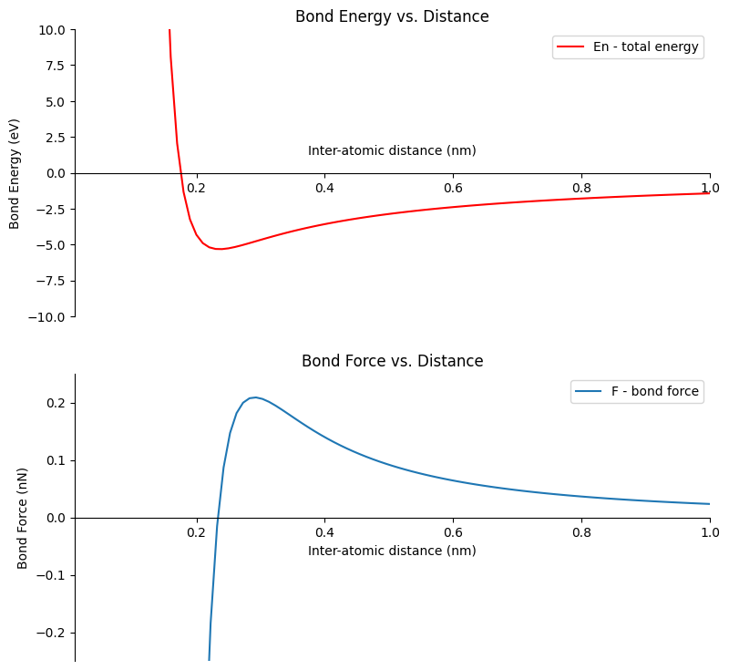
Calculate the equalibrium bond energy and the equalibrium bond distance#
The last thing we will do in this section is finding the equilibrium bond energy, E0, and the equilibrium bond distance, 2r*.
The equilibrium bond energy is the minimum energy (the minimum y-value) on the Energy vs. Distance curve. We can see from our plot the energy minimum is a little less than -5.0 eV. NumPy’s np.min() function can be used to find the smallest value in an array. After we find the minimum value, we can print it out using a Python f-string.
# calcuate the equalibrium bond energy and the equalibrium bond distance
eq_bond_E = np.min(En)
print(f'Equalibrium Bond Energy: {round(eq_bond_E,2)} eV')
Equalibrium Bond Energy: -5.32 eV
The equalibrium bond distance is the distance (the x-value) were the ions are at their energy minimum. This means we are looking for the distance value were the energy is at it’s minimu. We can use a boolean mask to find the location of the minimum bond enegy En==eq_bond_E and then index out of our array r using this mask. After we find the equalibrium bond distance, we can print it out using a Python f-string.
eq_bond_d = r[En==eq_bond_E][0]
print(f'Equalibrium Bond Distance: {round(eq_bond_d,2)} nm')
Equalibrium Bond Distance: 0.24 nm